
SARANKCO
Visual Identity Rebrand
Founded in 2007, SARANKCO: Creative Studio works closely with a range of clients, big and small, to bring their brands to life. SARANKCO is made up of talented individuals who each bring unique perspectives and wealth of expertise. Focusing on this talented team, the 2022 rebrand highlights those collective of people, or Co., who help make SARANKCO the branding powerhouse that it is.

Keeping the recognizable SARANKCO yellow, we expanded the previous color palette to include a deep Navy Blue and a series of secondary colors. These new additions allow for a more modern, expansive, and flexible Visual Identity.
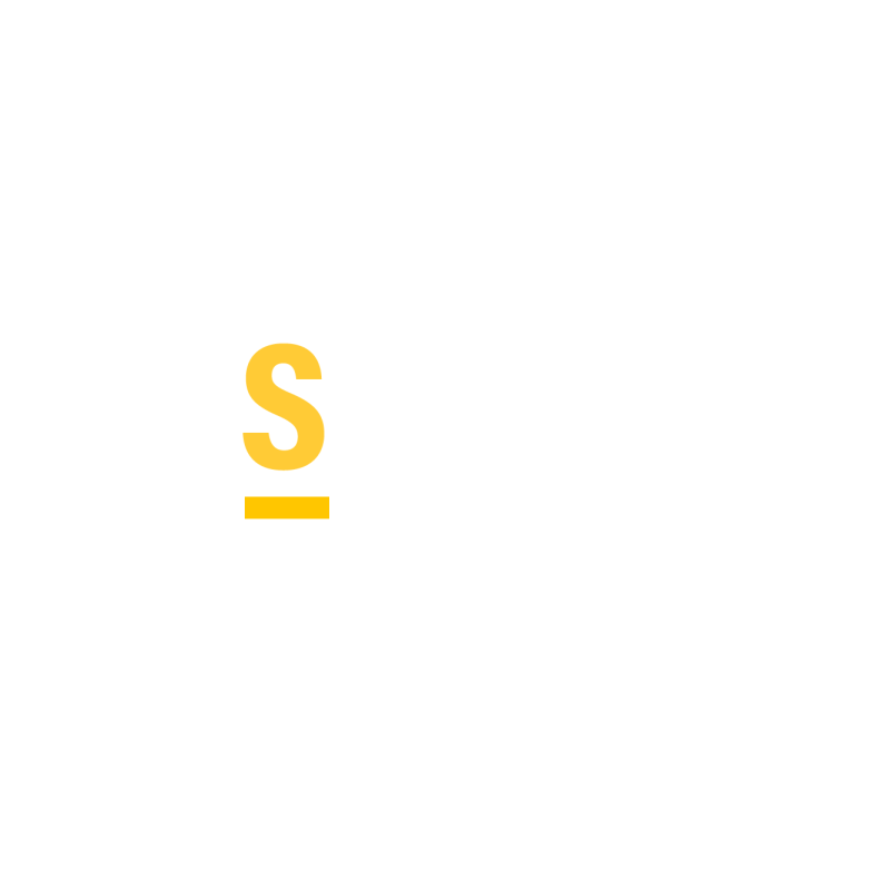
The stacked SARANKCO is our primary logo. By adding the rule and period under “CO” are we are able to add emphasis and call attention to the collective of people that make up the team.

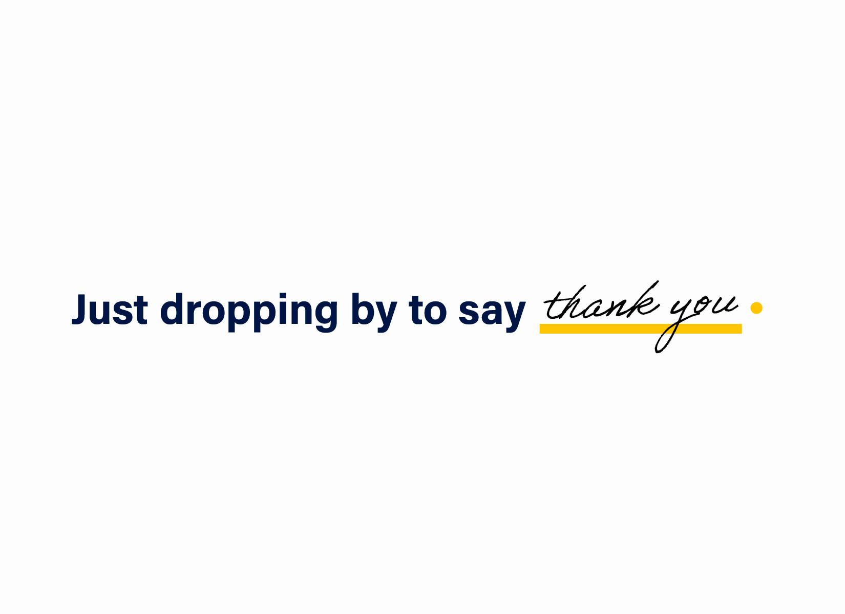
The rule and period can help expand the visual identity of the brand — transforming into patterns with use of the secondary color palette and creating opportunities for customization with handwritten and personal touches.


The symbol can be used large and small, and function from social media icons to larger splash moments that become textural.

Continuing with the handwritten, personalized, and warm feel of the brand to create moments of delight in printed pieces, like stationary.

Because of its modular design and cadence, we can use the parts of the logo to create additional patterns and textures, always with emphasis on the greater collective.
Animated GIF’s for social media to introduce new team members, highlight their personalities and unique traits


2022 SARANKCO Rewind social media post, highlight accomplishments, milestones, and special moments of the team, in and out of the office.